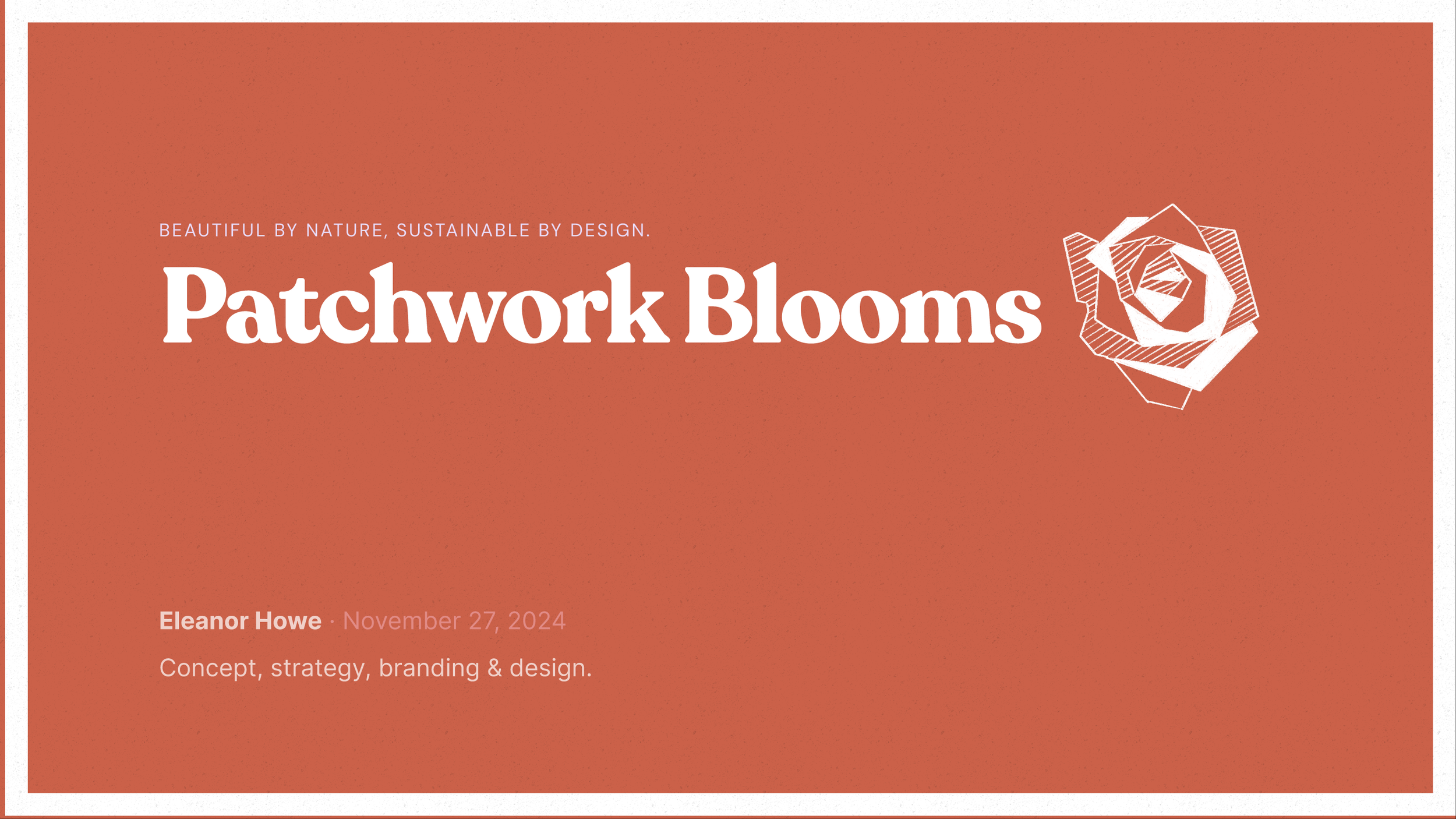
Brand Concept & Strategy · Visual Identity · UX/UI · Video

Three choices. That’s it? That’s IT! Patchwork Blooms brings sustainability and simplicity to flower delivery by converting seasonal surplus into three thoughtfully curated options: Petal, Blossom, and Bounty.

The Patchwork Path
From problem to prototype, one stitch at a time.
-
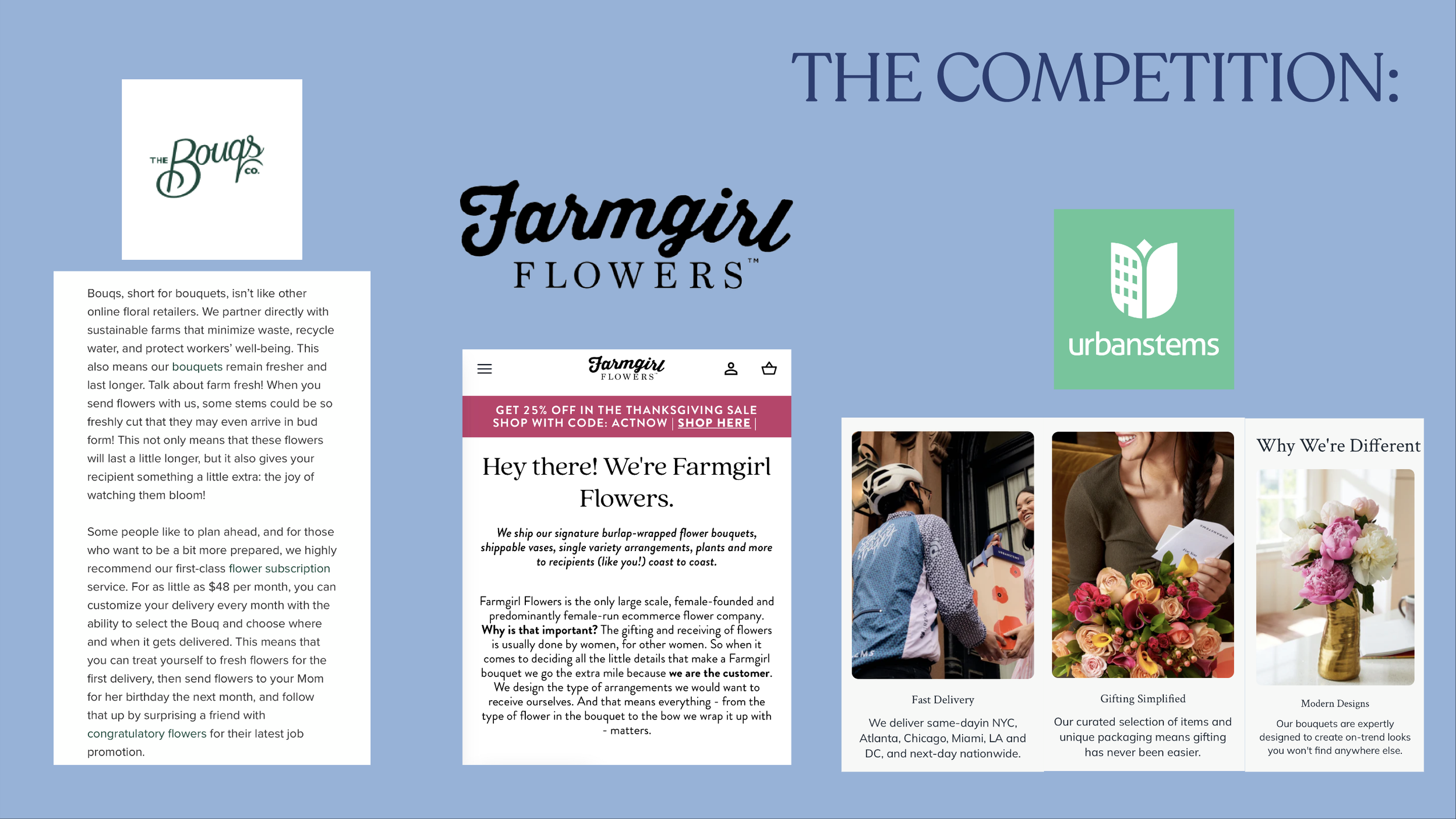
Too many options, too much waste.
The floral delivery space is saturated with cluttered UX and overwhelming choices, often reliant on imported flowers and wasteful packaging. Consumers looking for a sustainable, beautiful, and quick gifting solution are left with decision fatigue and generic results.
-
From surplus to simplicity.
Through competitive analysis, I discovered an opportunity to flip the problem on its head: what if limiting choice could become a strength? I sketched geometric flower illustrations in Procreate, evoking hand-crafted simplicity. These became the visual cornerstone of the brand.
I built out:
A cohesive brand identity using Recoleta Bold for a fresh-but-nostalgic tone
A vibrant, nature-inspired color palette
Branding collateral including embossed flower tags and delivery vehicle wraps
A full website prototype showcasing UX principles grounded in clarity and delight
An emotional brand video, narrated using Eleven Labs and scored with original music
-
Less to choose. More to love.
Patchwork Blooms solves for both overwhelm and waste by offering only three bouquet options: Petal, Blossom, and Bounty – all made from locally sourced surplus blooms. Each bouquet is wrapped in repurposed burlap coffee bags and labeled with recyclable embossed tags. The site clearly lays out size tiers and subscription options, streamlining the path from curiosity to purchase.
A playful brand video and illustrated elements reinforce the ethos: sustainable can be joyful.
-
Tools: Figma, Procreate, Adobe Premiere, Eleven Labs
Roles: Brand Strategy, Visual Identity Design, UX/UI Design, Motion Design, Copywriting
Too many options. Too much waste.
Most flower delivery sites overwhelm with endless choices, non-local blooms, and layers of upsells. Patchwork Blooms asked: what if we offered less so it could mean more?
The Problem


Sketches become Systems.
I explored visual simplicity by hand-illustrating geometric, mosaic-inspired blooms in Procreate, grounding the brand identity in warmth, play, and the authenticity of the handmade.
I generated photorealistic images for my website using iterative prompting with Midjourney. Meanwhile, competitive research led to an important insight: maybe choice limitation could be a defining feature, not a flaw. Every subsequent design decision flowed from that core truth.
The Process

Texture, Color, Care.
The brand lives in the details: vibrant vehicle graphics, tactile flower tags, and repurposed burlap wrap from coffee bean bags. Every piece reinforces the value of making something beautiful and unique from what might otherwise be thrown away.
The Brand System


The Solution

Less to Choose. More to Love.
At its core, Patchwork Blooms is about the gift of beautiful flowers, yes, but also the gift of limited, values-aligned choices and a streamlined ordering process for the gift-giver. Patchwork Blooms offers three clearly defined bouquets, as well as three subscription tiers. Each is rooted in seasonality, priced simply, and beautifully presented. The site guides the user seamlessly toward a joyful decision. No guesswork, no waste.

Petals with a Purpose.
This short video brings the soul of Patchwork Blooms to life, combining original music, heartfelt (albeit AI-voice) VO, and an invitation to slow down and savor what’s local, seasonal, and real.
Brand Video